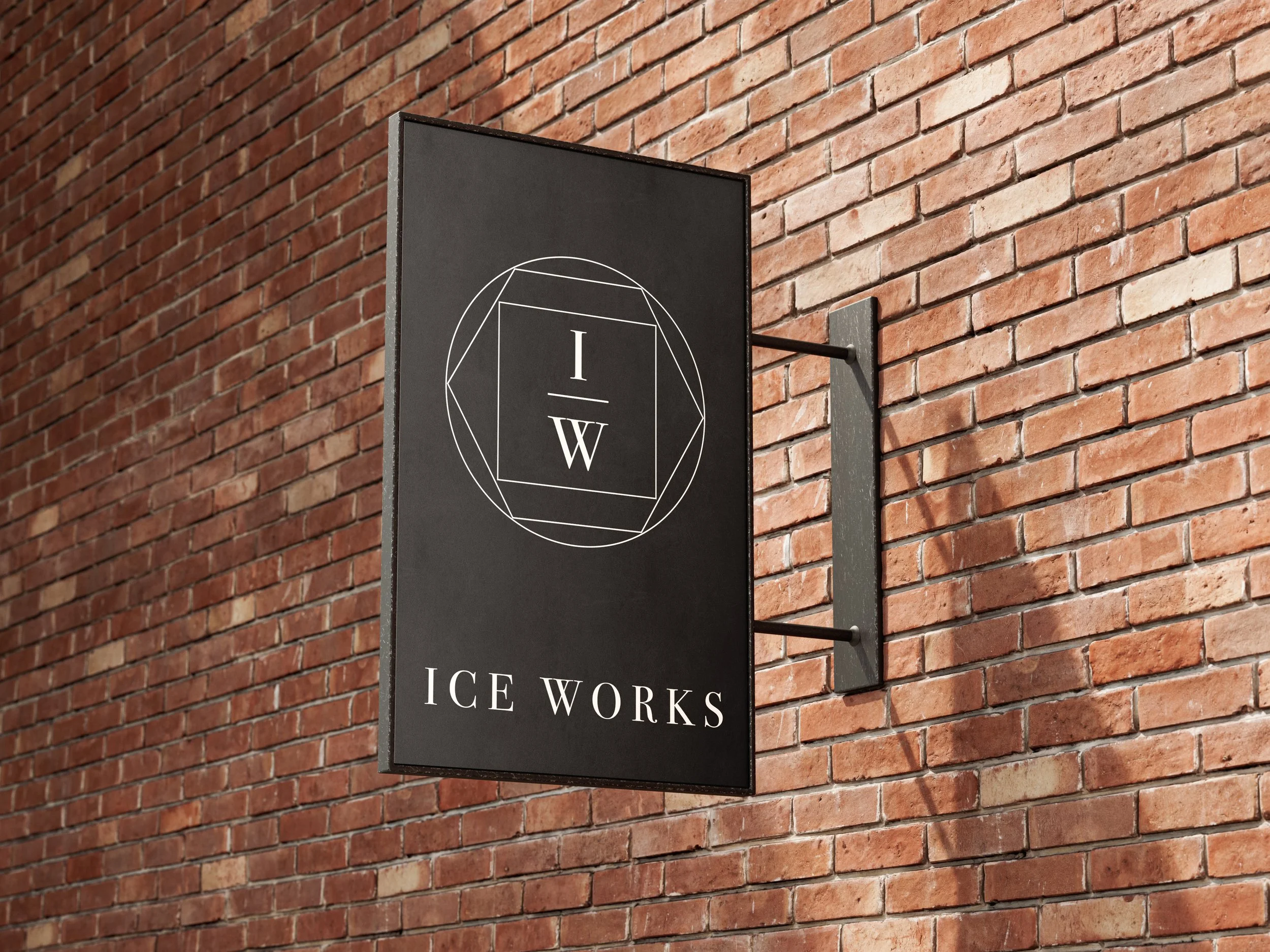
Ice Works
LOGO | BUSINESS CARDS
Brand identity for a new business selling specialty ice. This client asked for a brand redesign that was classy, clean, elegant; masculine; Great Gatsby-esque.
I worked with a very classic black and white color scheme to achieve this look. Using black as the background gives a more masculine, Gatsby-esque feel. The three shapes in the logo represent three of the ice shapes sold by the business. The hexagon has even further meaning: an ice molecule in its simplest form is a hexagon. The three shapes together mimic a diamond, which implies elegance.
The dramatic serif font also contributes to the elegant and upscale look and feel.
Business Cards are printed on thick paper with a velvety soft touch finish to portray elegance and luxury with another of the five senses. Raised spot gloss on the logo gives the appearance of ice while adding visual interest.


