Zinnia Cafe & Events
LOGO | BRANDING | SIGNAGE | MENU DESIGN | PACKAGING | ADVERTISEMENT DESIGN
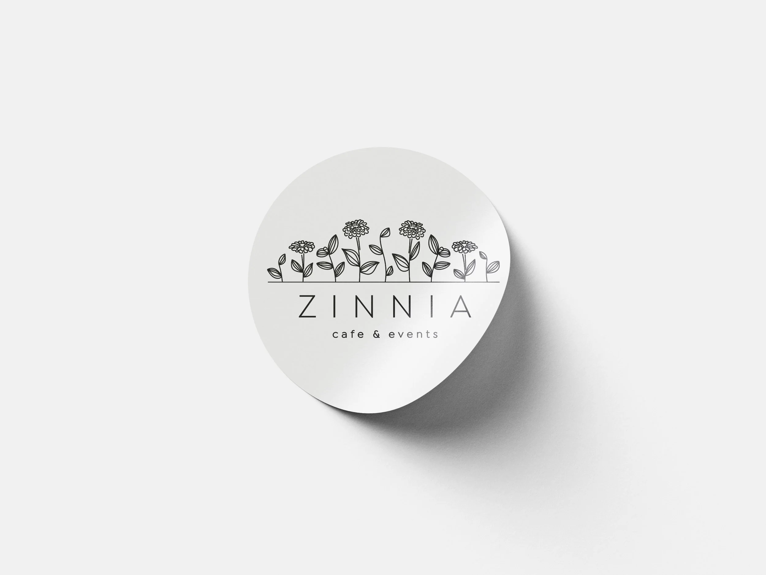
The ask for this project was a rebrand for Zinnia Cafe & Events, an upscale lunch restaurant located inside an art museum, adjacent to a garden patio. To brand this business, I focused on an elegant, modern, and creative design. Because of the name of the restaurant, and its location next to a garden, I knew I wanted to incorporate a floral motif into the logo design. The hand-drawn style of the zinnia flowers honor the restaurant’s location in an art museum. Uniform lines and a sans serif font keeps it clean and modern. I also created a pattern from the logo elements.
PROCESS
In the early stages of logo ideation, Zinnia flowers were incorporated in various unexpected ways.
These are the other three logo concepts I presented, along with my original notes about each idea, presented to upper leadership and key stakeholders.
Inspiration: Simplified zinnia drawing turned into a geometric graphic element
Art “within the lines”
The most graphic/modern option
The most masculine of the 4 options
Implementation: Color could be incorporated well
Inspiration: The essence of a zinnia flower without a literal representation
Easy-going/joyful - reflects the simple joy of flowers
The most casual of the 4 options
Handwritten/homemade feel
Inspiration: Urban Garden
Art “outside of the lines”
Hidden Meaning: The Z font is the same font used for TASTE Catering & Events branding. The strong serif font also lends to an elegant, upscale feel.
The most upscale/sophisticated option
Almost a “Vogue” feel
Additional Branding: The hand-drawn zinnias could double as a pattern on the back of menus


